Line/Box plot tool
This tool is part of the Analysis tab from the umIToolbox app. It displays scalar (i.e. single values) or time vectors (i.e. 1 x N array).
Note
This documentation does not cover the steps that precede the usage of the Line/Box tool.
For more information on how to create the files used in the Analysis tab of the umIToolbox app.
To use the tool, first, select the recordings and files. If the data contains scalar or time series, the Line/Box plot button will be enabled. Launch the tool by clicking on Line/Box plots button.
The interface
The interface comprises of three or more figures: the display options, main window and one or more summary windows:
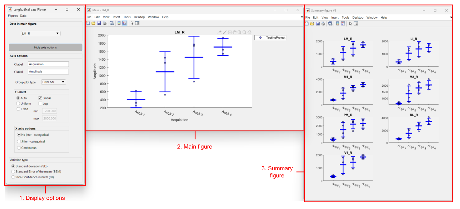
Main components of Line/Box tool interface. (1) Display options: controls the axis parameters and changes the data shown in the main window. (2) Main window: figure with larger axis for data exploration. (3) Summary window(s): one or more figures containing up to eight small subplots each.
1. Display options
- Menu >> Figures >>
- Save to .FIG: saves individual plots in Matlab's .fig file format
- Export: exports individual plots to one of the following image file formats: .PNG (24-bit), .JPEG (24-bit), .PDF or .EPS
Note
Each plot will be saved in a separate file with a name composed of a string and the name of the ROI appended with an underscore (FILENAME_AXIS-TITLE). - Menu >> Data >>
- Select: launches the data selection tool. This tool allows one to determine how the data is displayed in the axes.
- Run hypothesis test: executes statistical comparisons on the data from each plot.
Note
Click here for more information on how the toolbox performs hypothesis tests on data!
Note
For scalar datasets, the Line/Box plot tool will display the data as the amplitude of different experimental groups as a function of the acquisition index with each axis containing the data of one observation (as the example shown in the figure above). For time series, the X axis will display the temporal profile of the dataset instead. - Data in main figure: dropdown menu with the axis currently displayed in the main figure
- Axis options panel:
- X/Y label: Text fields with main figure's axis labels
- Group plot type dropdown menu >> For scalar data ONLY:
- Error bar: Shows error bars with group average ± variation (see variation type panel options below)
- Box plot: Shows a box plot per group per X data value with the following measures:
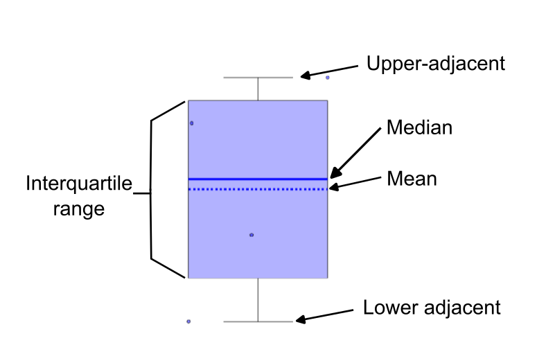
Here, the interquartile range is the range between the 25th (q1) and 75th (q3) percentiles while the upper and lower adjacent values are the highest and lowest value that fall inside the whiskers' lengths. The lengths of the upper and lower whiskers are calculated as follows : upper_whisker_lenght = q3 + 1.5 × (q3 – q1) and lower_whisker_length = q1 – 1.5 × (q3 – q1)
- Y limits panel
- Auto: sets automatic Y limits for each individual plot (default)
- Uniform: sets the same Y axis limits to all plots
- Fixed: set Y limits to all plots using the min and max values
- Linear: sets the Y scale as linear (default)
- Log: sets the Y scale as logarithmic
- X axis options panel
Available for scalar data only.
- No jitter - categorical: places the group data side by side around each X data point (categorical) with the scatter dots vertically aligned (default)
- Jitter - categorical: similar to the option above but the scatted dots are randomly distributed around the X data point (i.e. jitter)
- Continous: considers the data as continuous and overlaps the scatter dots and error bars of all groups over the X data points. Here, a line plot is shown linking a the error bars of a group. Boxplot not available for this option
- Variation type panel
Not available for box plots.
- Standard deviation (SD): Sets the error bar as standard deviation (default)
- Standard error of the mean (SEM): Sets the error bar as SEM
- 95% Confidence Interval (CI)Sets the error bar as 95% CI of the mean. Available with Statistics and Machine Learning Toolbox
- Time vector style panel
Available for time vector data only.
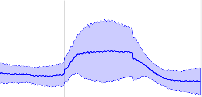
- Shaded: Shows the data variation as shaded area around the average line:
- Lines: Shows the individual traces as thinner lines:
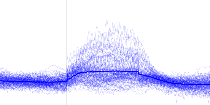
- Shaded: Shows the data variation as shaded area around the average line:
Tip
The X and Y labels have the Interpreter property set to Tex. This allows one to add special characters. For instance, the text \DeltaF/F (x100) will be displayed as ΔF/F(x100).
2. Main window
Figure containing the plot of the ROI selected in the Display options figure (1).
Tip
Use the figure's datatip icon (![]() ) to explore the data. Select individual data points to retrieve the meta data such as the recording ID, date, subject ID etc. For box plots and error bars, the group measures (e.g. mean, variation) are summarized in the data tip. See example below:
) to explore the data. Select individual data points to retrieve the meta data such as the recording ID, date, subject ID etc. For box plots and error bars, the group measures (e.g. mean, variation) are summarized in the data tip. See example below:
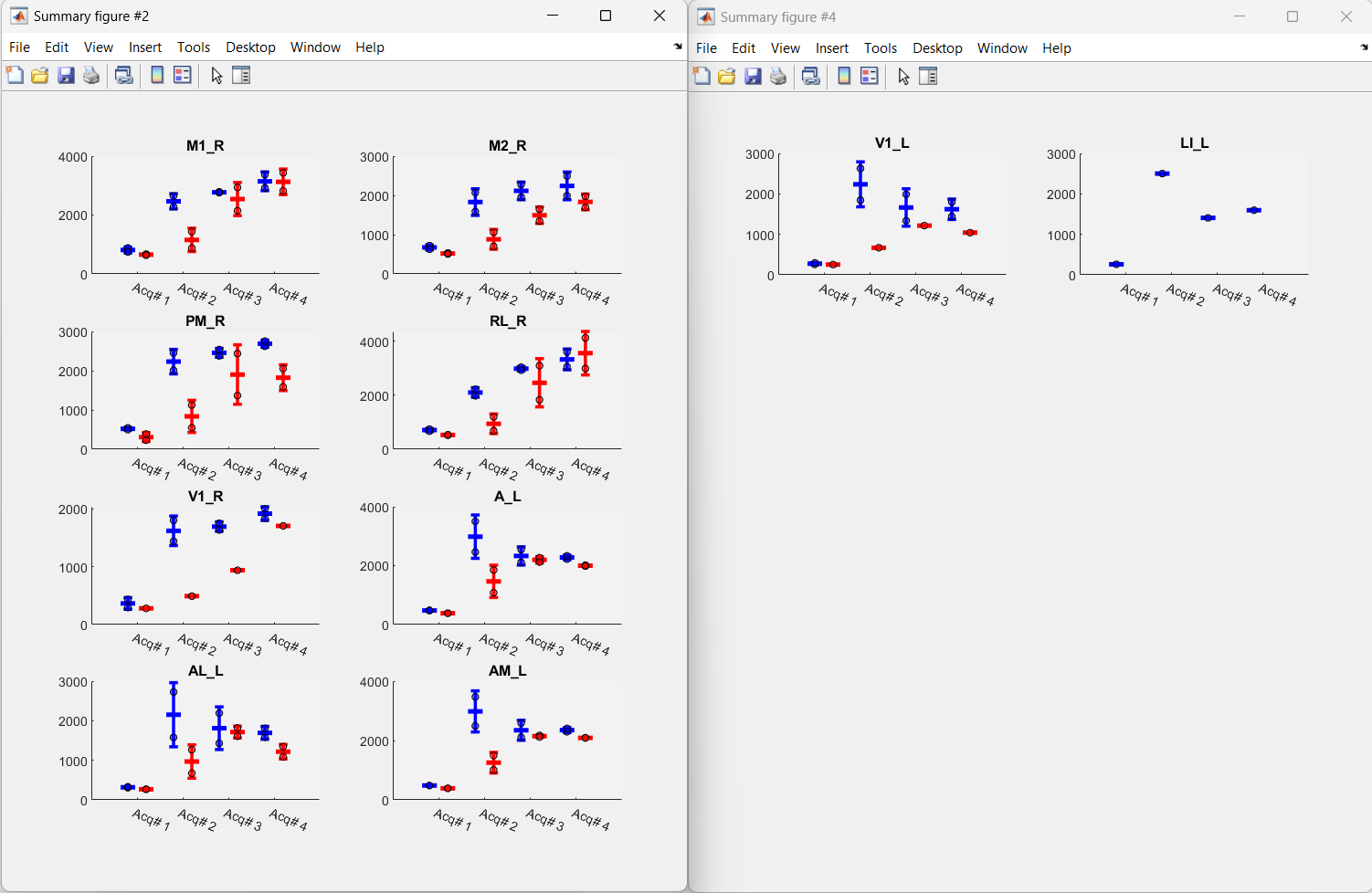
3. Summary window(s)
Figure containing up to eight plots of all observations loaded. An extra figure will be created for each subset of observations: